How to create accessible Word docs
June 23, 2016
Author: Diana Pounds
Author: Diana Pounds
Inaccessibility can sneak into websites, email and other digital content in unexpected ways. Uploaded Word documents, for example. Many Word docs posted to the internet don't meet accessibility standards. Often, the problem is improperly structured documents that prevent voice-to-text screen readers from making sense of the documents. Poor structure also can hinder easy access for those with learning disabilities as well as general audiences.
Fortunately, the fix is fairly easy. These tips will help you create accessible Word docs that look (and sound) good.
Got questions? Contact web accessibility coordinator Zayira Jordan, zjordan@iastate.edu.
Those who see a document grasp its structure at a glance. The large, boldface type at the top surely is the headline. Smaller boldfaced lines mark the subheads. Bullets, squares or other tiny icons distinguish items in a list. And words decorated with italics or color signify special meaning.
Unfortunately, fonts, bullets and other visual cues are useless to screen readers. These devices need structural markup that essentially conveys information like this:
How do you get structural markup into your documents? Simply use Word's styles and tools to format your copy. Word will take it from there, automatically inserting the hidden markup that makes documents accessible.
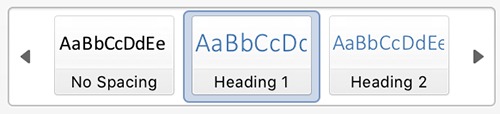
Word's heading styles are in the ribbon (top, right)
All headers (large and small) should be formatted using the heading styles located in the ribbon on Word's home tab. Look for the "styles" section. To apply a style to the main header, highlight the header and click "Heading 1" in the style box. Give the next most important heads "Heading 2" styles, third-level heads "Heading 3" styles and so on.
Styled headers allow individuals using screen readers to scan documents by skipping from header to header. When a screen reader encounters a header, it announces the heading level, then the headline. For example, the screen reader might announce "heading level 1, how to create accessible Word docs" or "heading level 2, it's all about structure."
When you apply headers or other styles in a document, Word displays the copy in its default style. For example Word's default style for "heading 1" is 16-point Calibri blue. If you don't like that look, you can change the default by right-clicking the heading style button and making your own selections. These cosmetic changes won't interfere with screen readers.
Use Word's style and tools on the rest of the document. For example, bullet and number options in the "home" tab create lists. Screen readers will respond by announcing each list and the number of items it contains.
For special sections or words, apply one of Word's ready-made styles, such as "strong" or "emphasis."
Use the "normal" style for routine text.
Images, charts and other art require "alt text," a description of the object. Alt text for the ISU logo might be: "Iowa State." Alt text for an ISU enrollment chart might be: "ISU enrollment has set new records for seven consecutive years, from 27,945 students in 2009 to 36,001 students in 2015."
To add alt text to an image or chart:
To be accessible, tables need both header rows and alt text. To include a header row in a table:
To add alt text to a table:
Hyperlinks that take you where you never expected to go are even more annoying when using a screen reader. Hyperlinks should be unambiguous and descriptive. A hyperlink that connects to Iowa State's homepage should say "Iowa State University" or "Iowa State University homepage." It shouldn't say "click here" or "Cyclone country" or "Iowa's land-grant."
Font styles and sizes aren't much of an issue for those using screen readers. However, undersized or hard-to-read fonts certainly create accessibility issues for many individuals who don't have 20-20 vision. The standard recommendation is to use familiar sans serif types (such as Arial, Verdana, Tahoma, Helvetica or Calibri) in 12 points or larger.
Word docs must contain certain basic information to meet accessibility standards. To insert info into your document, go to "properties" under Word's "file" menu. To meet standards, fill in the title, subject, keywords and author. You'll also need to fill in the language for your document. On PCs, look for the "custom" tab in the "properties" section. On Word for Macs, "language" lives under the "tools" menu.
An accessibility checker is available for some new and old versions of Word for PC. A checker is not available in newer versions of Word for Mac.
Here's how to check the accessibility of your Word (PC version) docs.